
Project Overview
Client: HSI
Timeframe: Q4, 2025
Request: Updated Style Guidelines and Provide Modular Solutions for Web Transition
HSI offers training, safety management and compliance solutions for businesses of all sizes. Our combination of technology and content solutions help safety, human resources and operations leaders train and develop their workforce, keep workers safe and meet regulatory and operational compliance requirements.
Following the acquisition of an Australian SaaS provider, HSI was in need of assistance getting all of their current and future teams on-track with a singular visual direction that embraced their history while looking ahead to a brighter, modern future.
The Ask:
Update the standards for HSI web assets and provide some module templates for internal team application to content. The updates should focus on bringing new acquisitions "into the fold" and modernizing existing guidelines without alienating currently circulating sales and marketing materials which would need to be updated on a significantly longer timeline.
Key Goals:
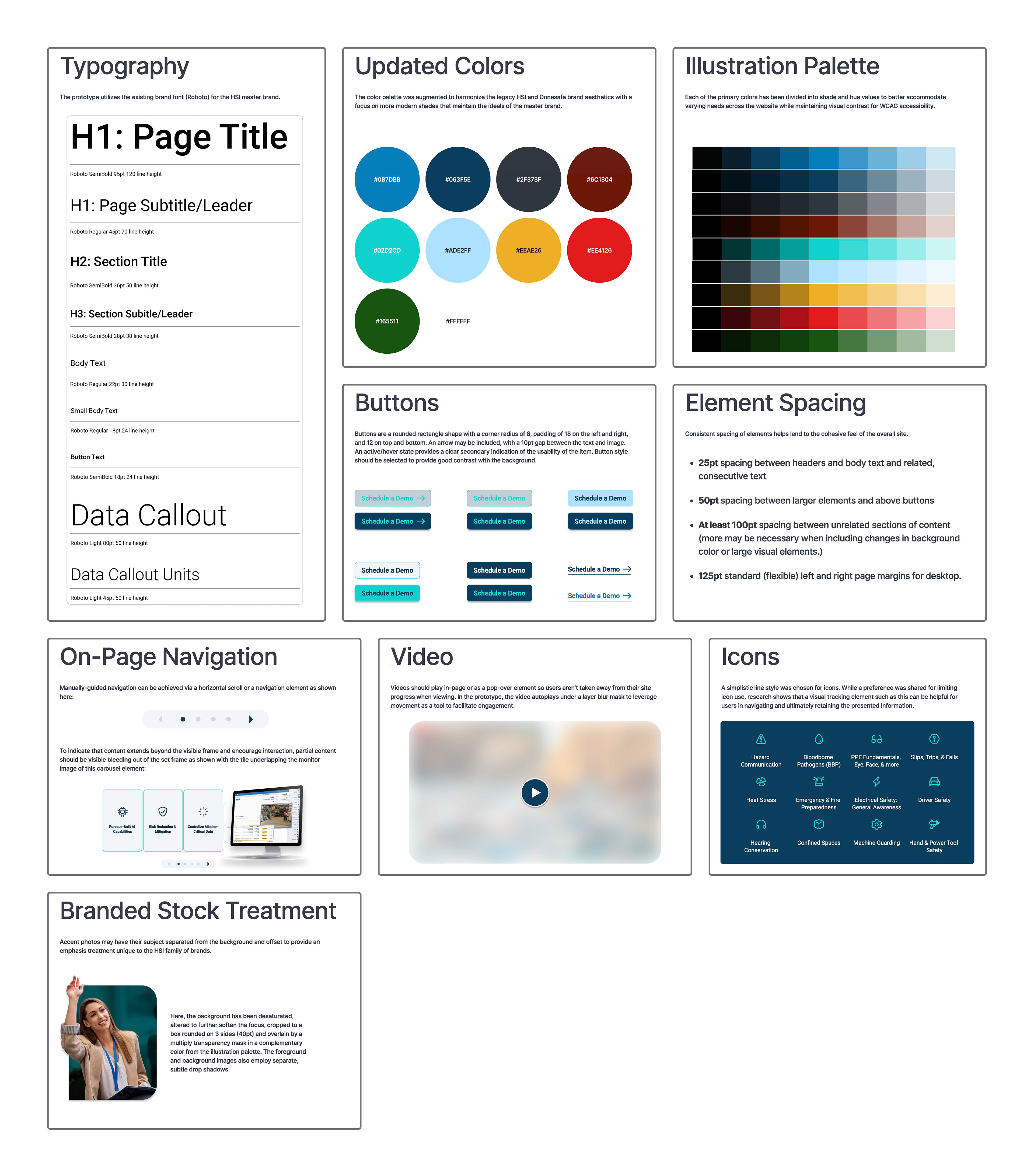
Modernize the HSI brand look including recommendations for modified colors, web configurations, and photo selection and treatment.
Harmonize existing style identity with these updates so existing assets would continue to "make sense" when paired with the new pieces.
Prepare a framework for future acquired entities to modify their own materials to align with the parent brand.
Provide a set of web modules for the HSI on-staff development team to "plug and play" into existing web pages.
Create a set of guidelines for the new style for immediate implementation and future expansion.
Action:
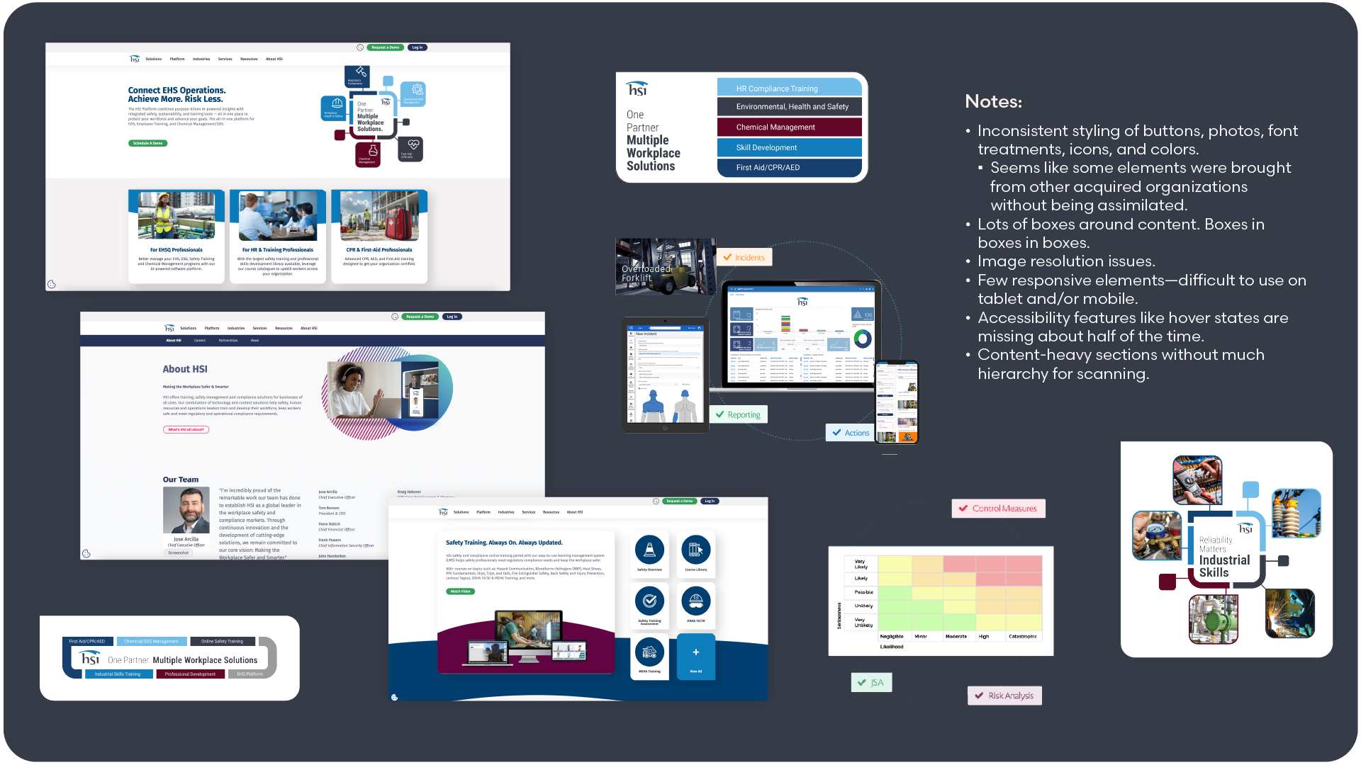
Speaking with the Director of Marketing at HSI revealed that the brand had recently entered into a season of rapid growth via acquisition and they needed help defining a framework to begin tying these new teams into the parent brand's aesthetic, preparing them for their new place in a more conservative global marketplace. They also recognized that the parent brand was due for some of its own modifications, but preferred a light touch that wouldn't over-burden their resources by necessitating updates to their entire collection of sales and marketing materials to maintain consistency.
These goals would be achieved by:
- Modernizing the base color palette for web.
- Defining guidelines for stock selection and use across websites.
- Creating an interactive homepage mock-up in Figma to act as a guiding light for future updates with web, tablet, and mobile views.
- Development of a series of Figma modules that could serve as inspiration and template for updates, including solutions specifically tailored to existing content.
- Create a reference sheet for the new changes.
- Provide development team with access to created Figma assets.
Takeaways:
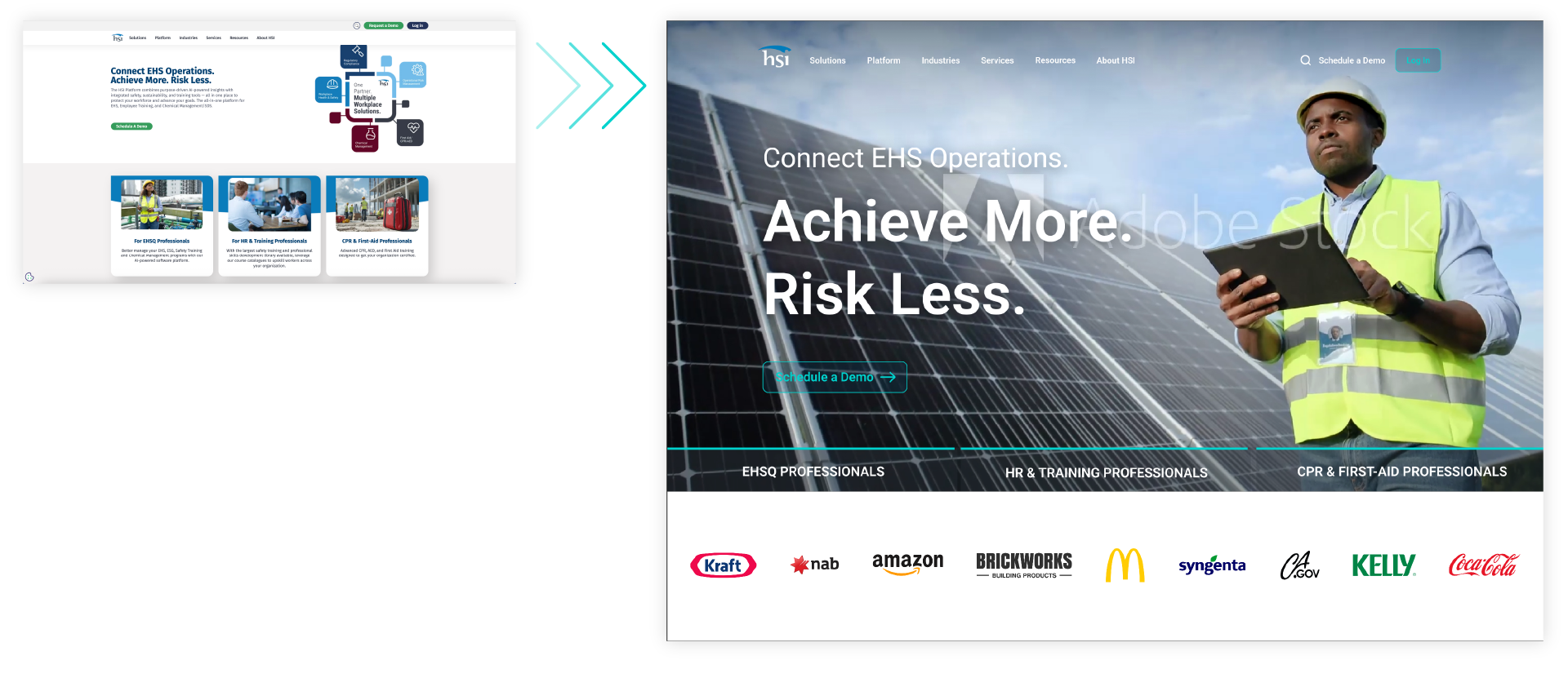
I'm very pleased with the outcome of this project. The updated homepage prototype manages to provide a modernized take on the HSI brand with more interactive touchpoints and improved hierarchy to support scanability and engagement. The modules and updated guidelines provide a launchpad for their staff developers to build future content and make updates on their own timeline while remaining distinctly HSI.
Discussions were managed through a single member of the HSI team. This was efficient on the front-end, but when the designs were shared with executive decision makers, new requirements and conflicting preferences came to light that led to significant reworking of assets and a late-stage renegotiation of the contract terms. This has inspired me to create a more thorough questionnaire for kickoff meetings including follow-up items for my point-of-contact to circulate with all of the decision makers in their orbit prior to beginning work. While adapting to shifting needs will always be part of the job, I think this will help increase transparency and empower all of the necessary stakeholders with a better idea of what they are looking to achieve.