Project Overview
Overview
In 2024, Advarra undertook a full redesign of its corporate website to better align with modern user expectations, improve search performance, and elevate the brand’s digital presence. This initiative extended beyond surface-level aesthetics, involving a complete overhaul of the site’s visual language, structure, and functionality.
Timeline
• April–July 2024 — Discovery and strategy phase
• August 2024–January 2025 — Execution and launch
Team & Collaboration
The redesign was executed by a lean in-house team of three: a Digital Marketing Lead, a contracted Web Developer, and myself (Design & UX Lead).
We partnered with an external agency during the planning phase to support discovery, user journey mapping, and structural planning. Final execution — including design, development, and content implementation — was led internally. Key decisions for each segment of the business were reviewed by a cross-functional stakeholder group of 5–7 members from Marketing, Sales, and subject matter experts.
Objectives & Strategy
Project Goals
The redesign of Advarra.com was guided by 4 core objectives:

Modernize the Visual Identity
Replace the illustration-heavy design with a photography-forward aesthetic.

Boost SEO Performance
Restructure site content and optimize technical elements to improve search visibility and organic reach.

Rebuild Around the Buyer Journey
Shift from an internally segmented architecture to a structure that reflects real buyer behavior and needs.

Elevate the User Experience
Create a more intuitive, informative, and goal-oriented experience across all page types and devices.
Strategic Approach
To ensure the redesign met user needs and supported business growth, we took a research-driven, user-first approach:

Data-Driven Discovery
We began by analyzing site performance metrics and user behavior to understand how visitors were interacting with the existing site. This informed a priority ranking of pages to carry into the new build and revealed clear areas for structural improvement.
Mapping the Buyer Pipeline
Our next step was defining the buyer pipeline and aligning it with web entry points. We looked closely at how prospective customers move through the clinical trials lifecycle and mapped those stages to potential pain points and service needs.

Rebuilding the Navigation for Clarity
The original site navigation reflected Advarra’s internal structure (Review Services, Technology, Consulting), which forced users to understand our business before identifying how we could help them.
The new navigation was reimagined to be empathetic and intuitive—meeting users where they are in their journey, addressing common pain points by market segment, and surfacing relevant solutions.
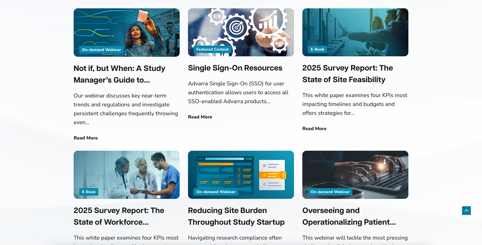
Content Consolidation & SEO Prioritization
The legacy site had significant content bloat, with many overlapping or outdated pages. To address this, we:
• Elevated high-value, SEO-performing content to dedicated pillar pages and prominent navigation positions
• Consolidated or deprecated lower-performing content, relocating it to a streamlined Resource Library with new info sheet templates
• Established clear rules for content hierarchy, placement, and future governance

Lifecycle-Based Interactivity
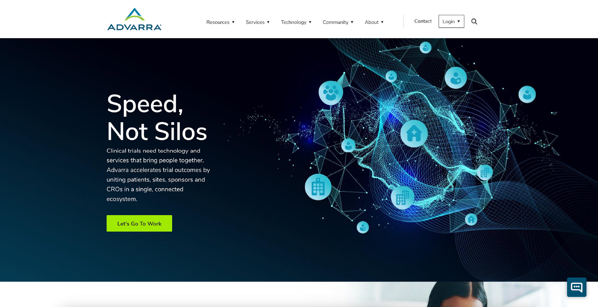
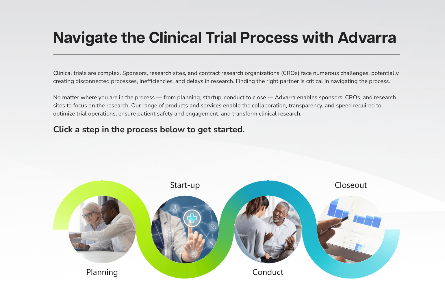
We also ideated on an interactive lifecycle graphic for the home page to offer a visual entry point into targeted pain points and related solutions, further aligning our digital content with the buyer's reality.


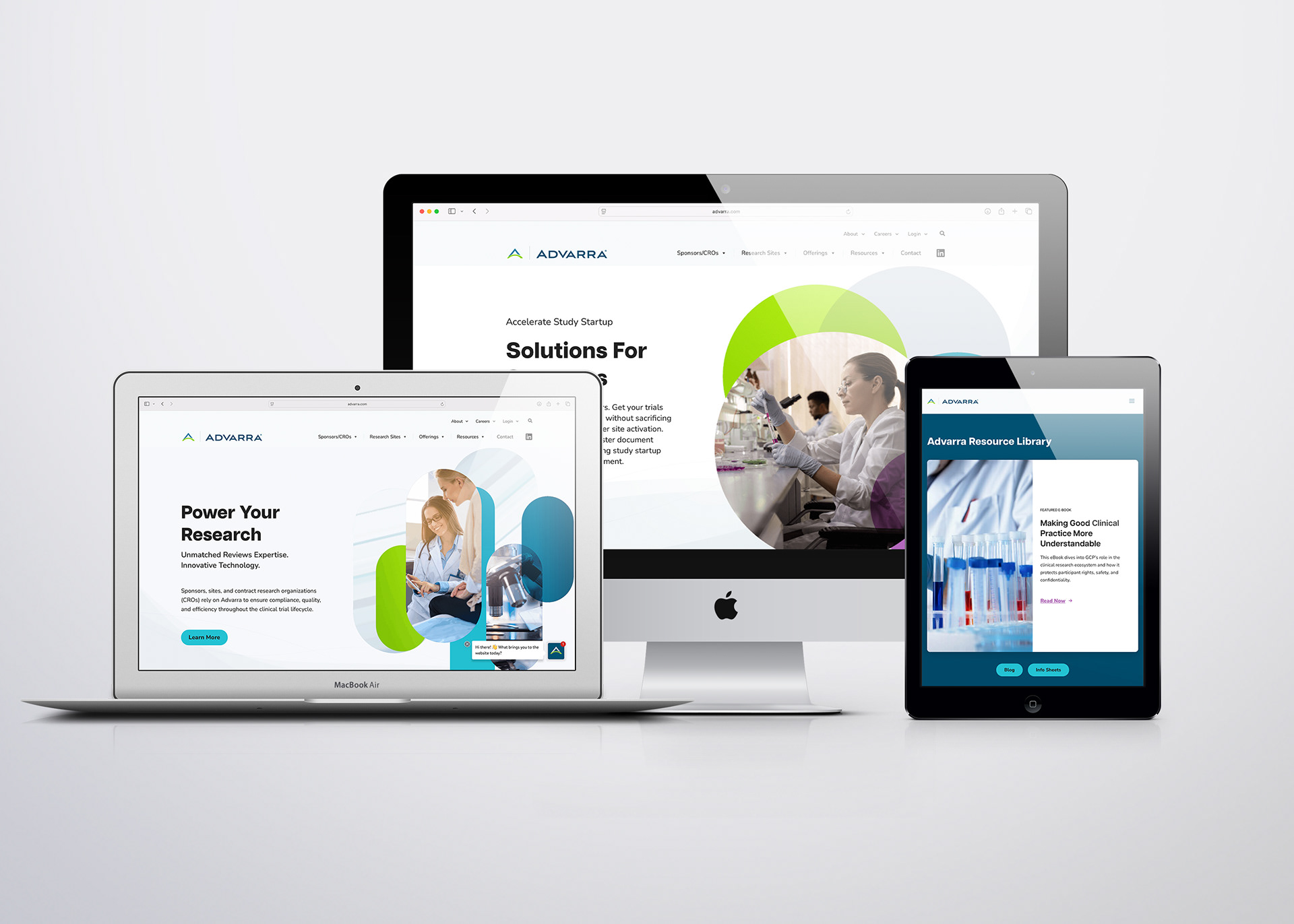
Visual Update
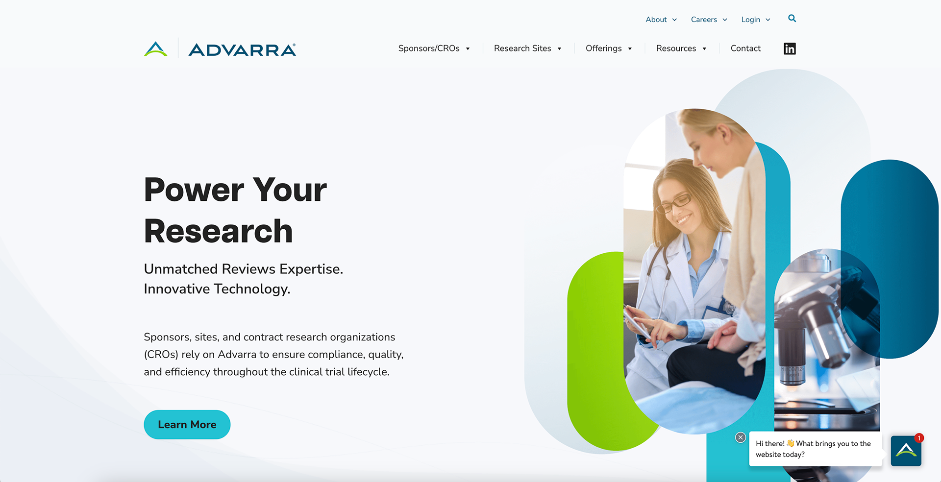
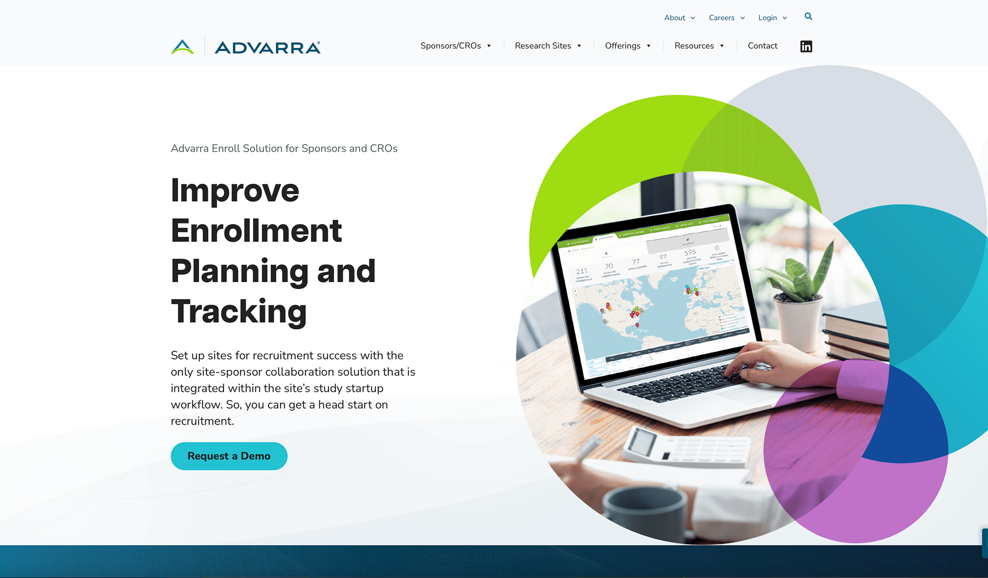
The Advarra rebrand sought to embrace the customer community's perspective more directly than had been attempted in the past. This meant a brighter and more hopeful visual tone and inclusion of stock photography to showcase authenticity and approachability. The gradient shape elements, in addition to providing unique visual interest, represent a coming together of disparate parts to create an enhanced, unified, more beautiful result.
Former Advarra.com homepage
User Journey-Enabled Navigation
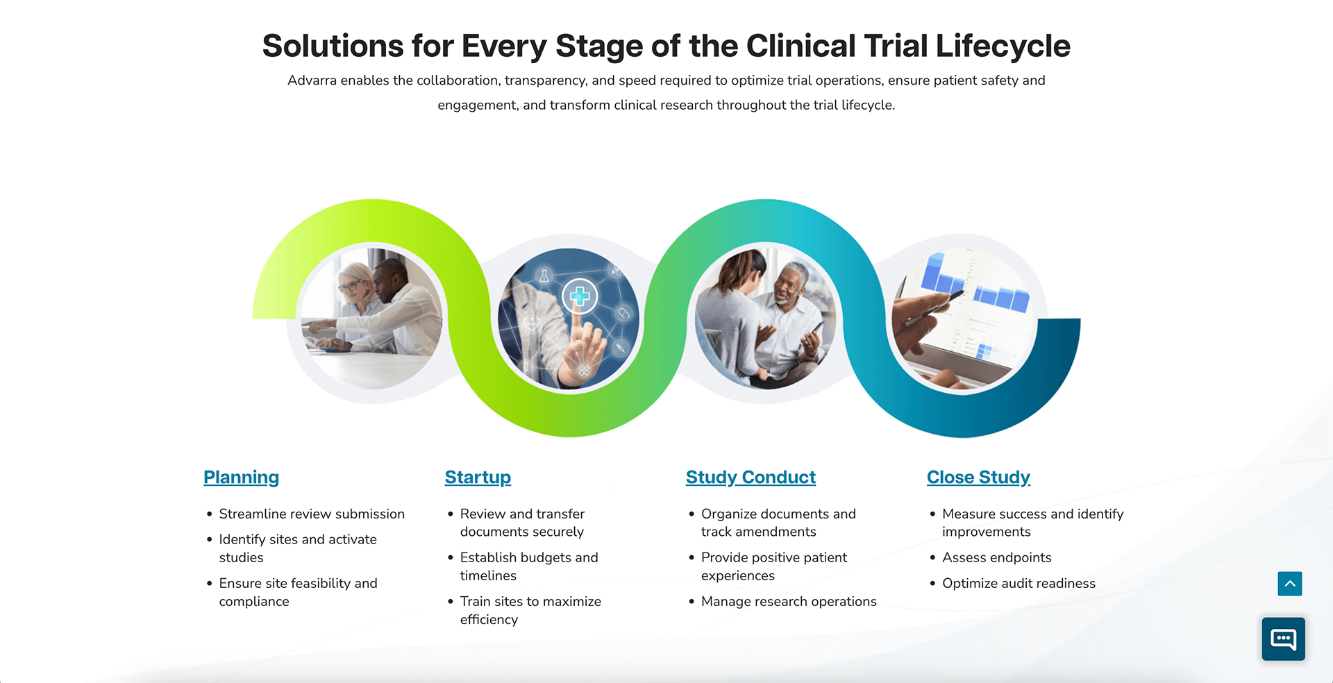
The client needed a way to display that they have options for many phases of the clinical trial lifecycle, so we developed an interactive flow graphic for the home page. Clicking on the images or headers within the graphic would opens a page with a detailed tab module outlining the offerings for that phase.
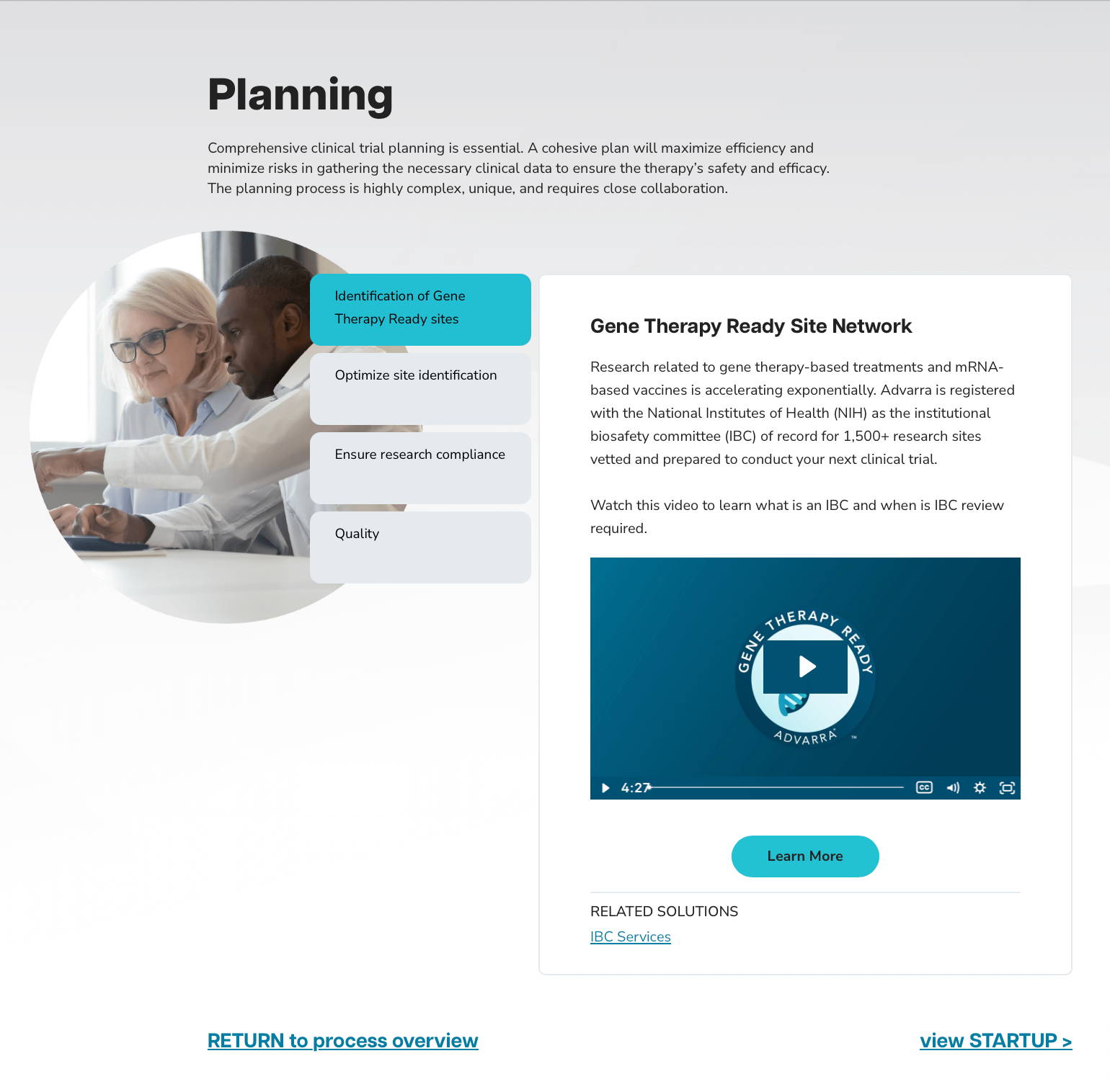
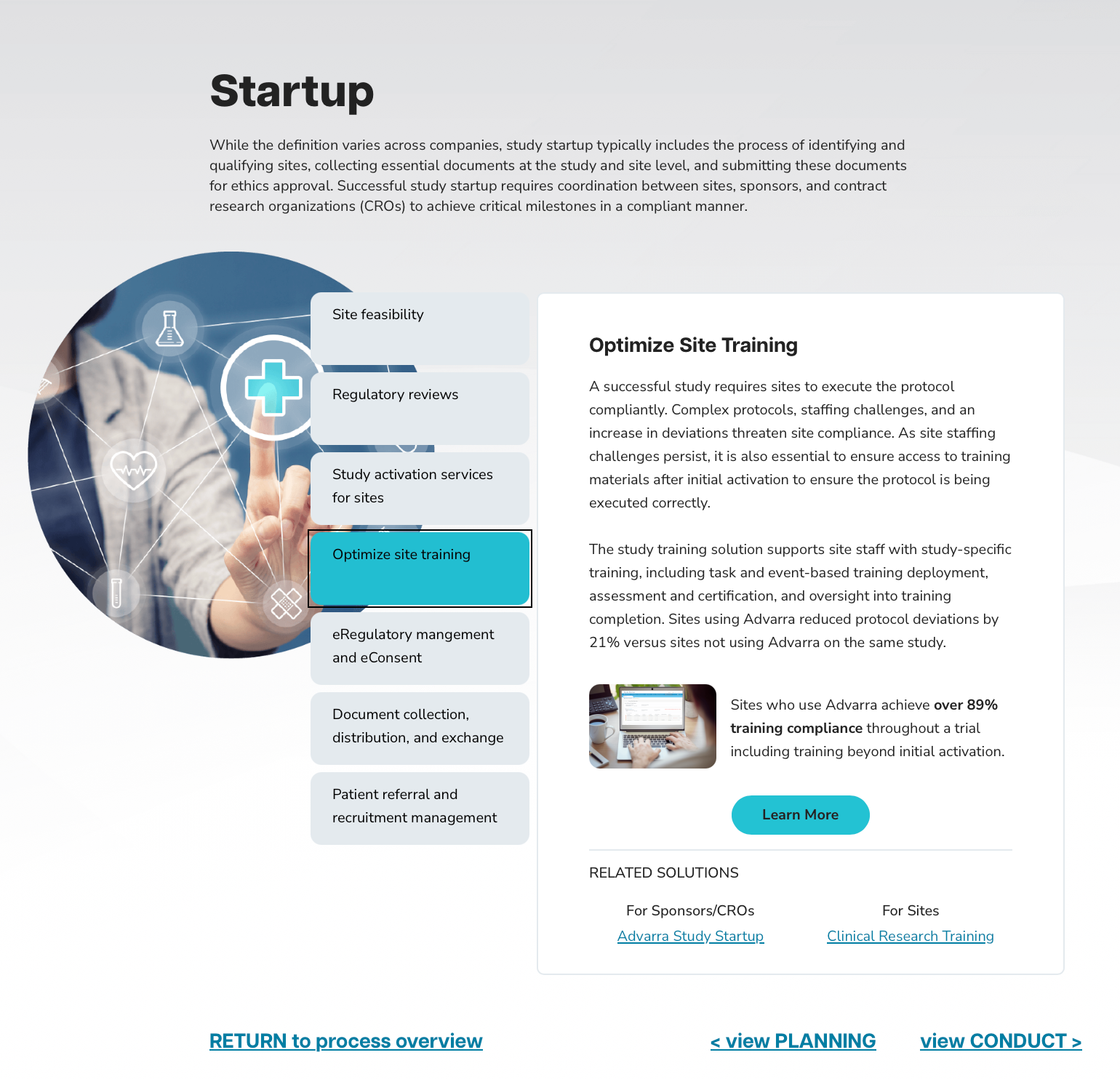
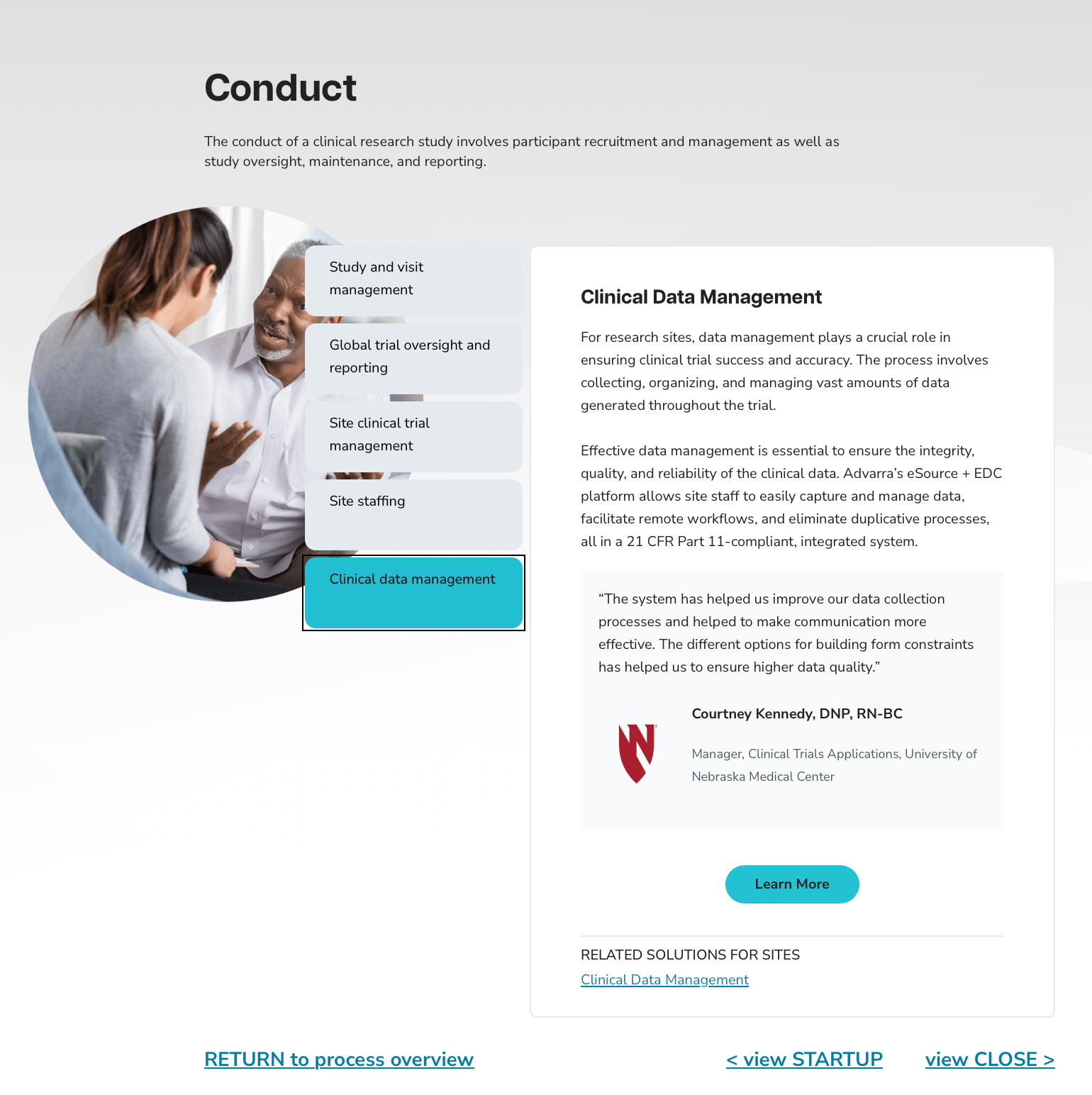
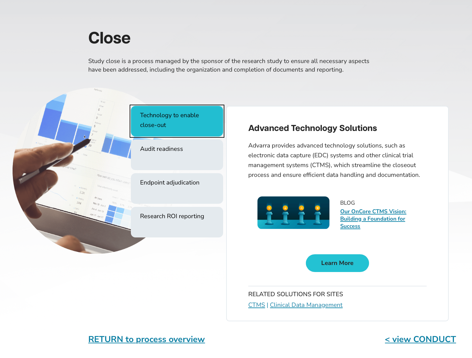
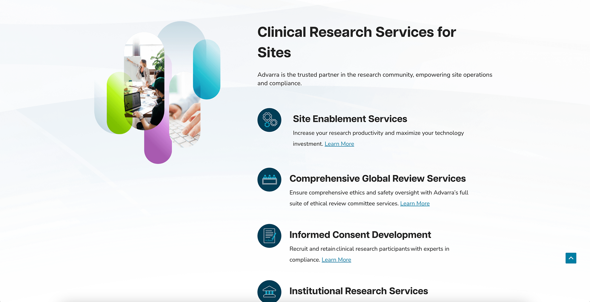
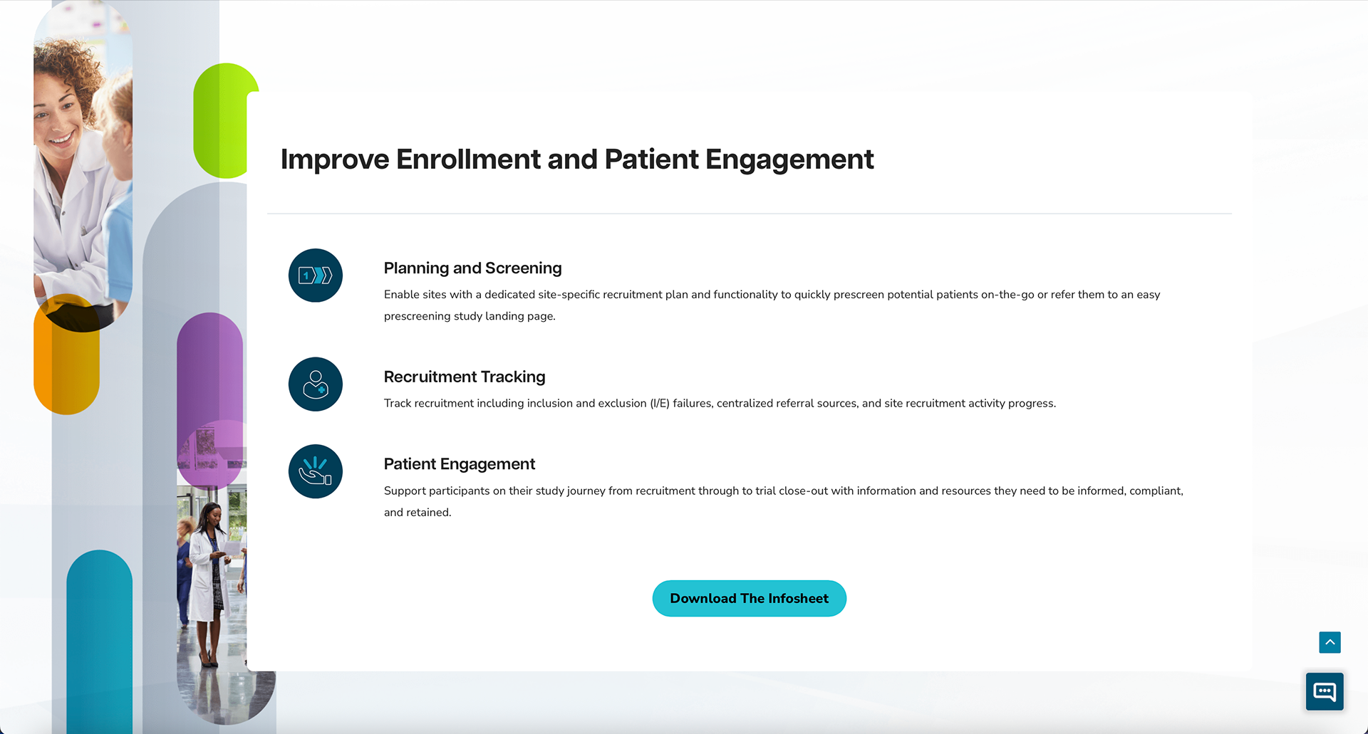
On pages that were more general, we opted for a 3-button CTA that would allow for the user to self-select into results that were applicable to them, and filter out the noise.

Diversity, Equity, and Inclusion
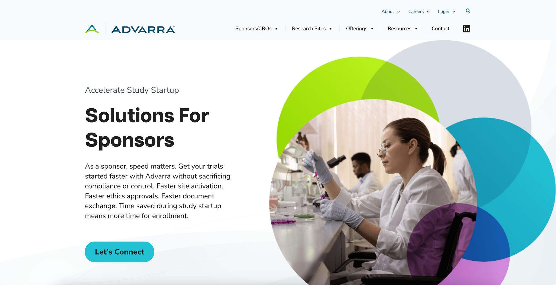
A provider serving the research community, Advarra's diversity, equity, and inclusion commitments were thoughtfully considered in image selection. We opted for images that featured a diversity of race, gender, age, and ability with a focus on authentic participation to avoid "tokenization" of these features.


Authentic Representation
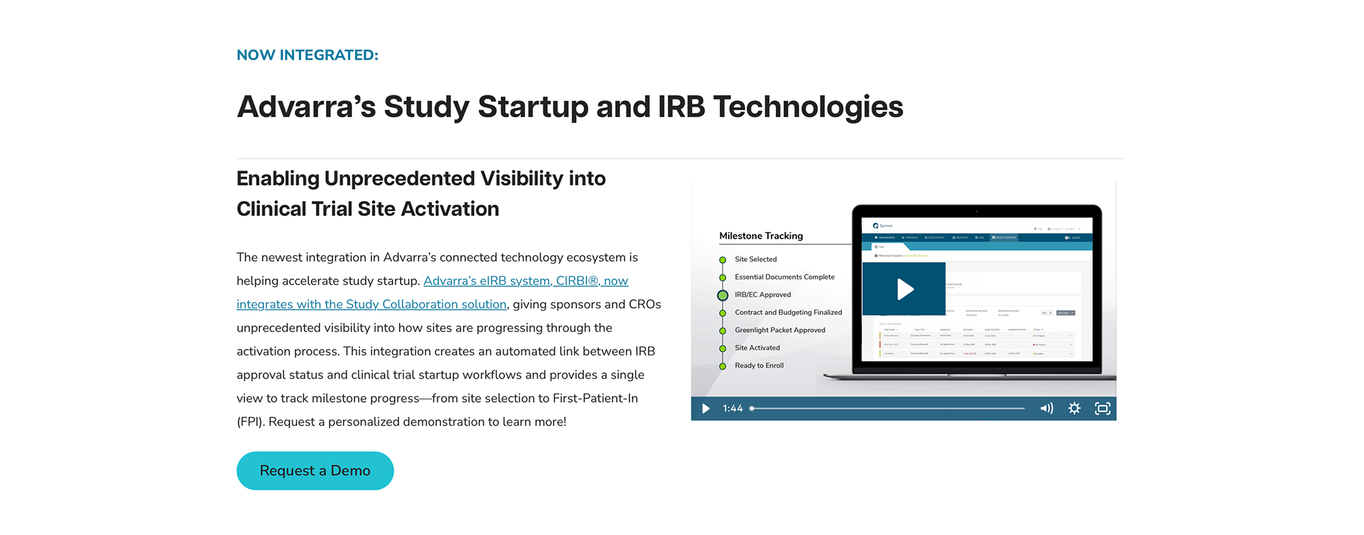
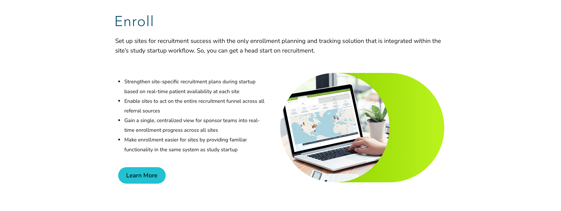
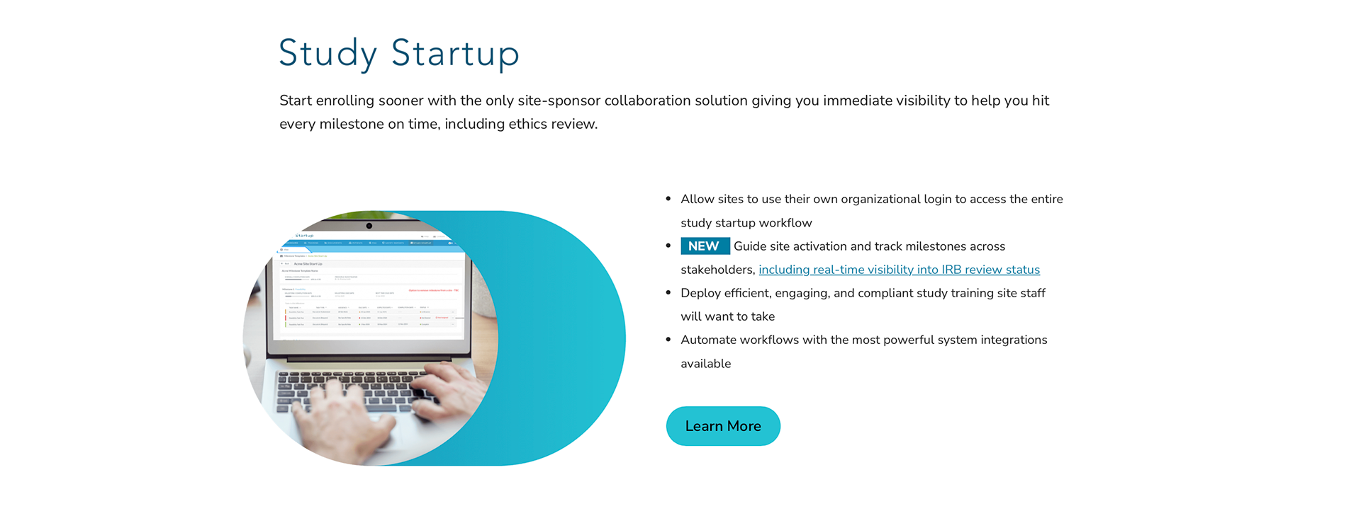
Special attention was also paid to showcasing real product screenshots where possible and authentically representing their various offerings, while staying true to the design aesthetic. Thus, images were often added into stock photos for a more organic look and feel.
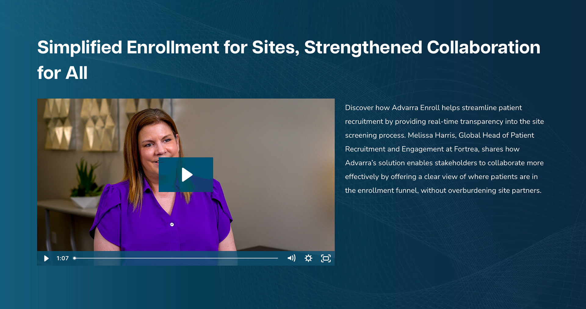
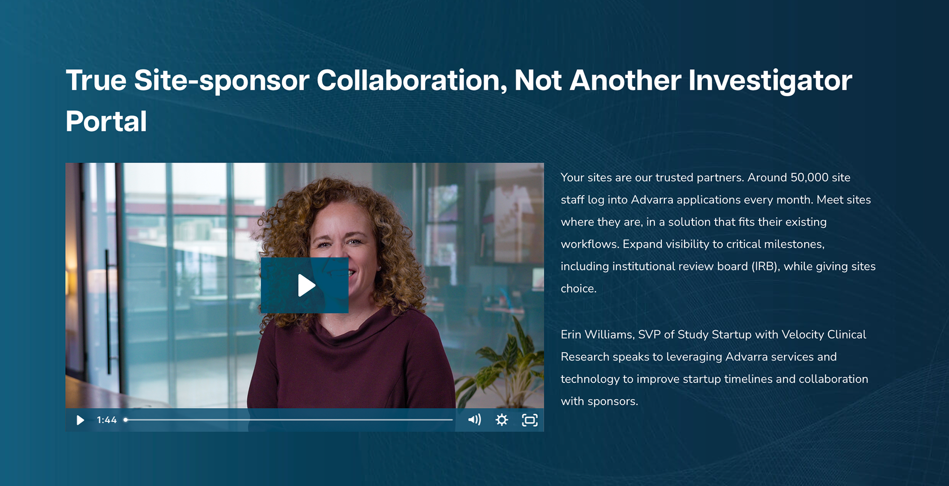
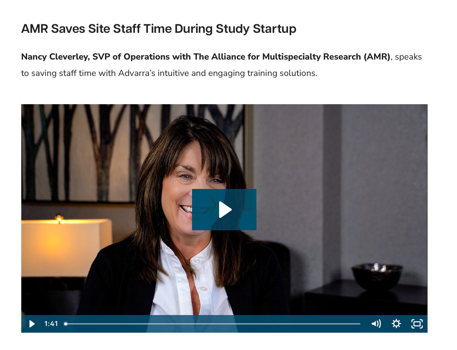
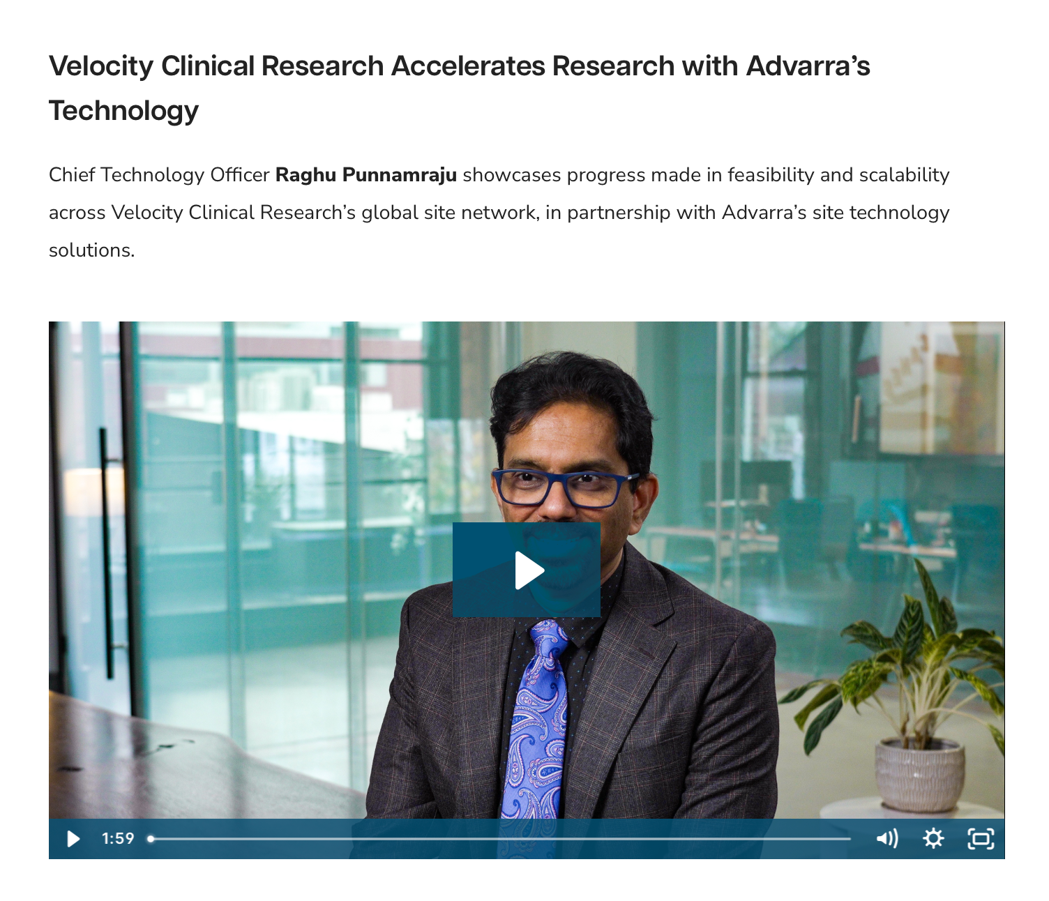
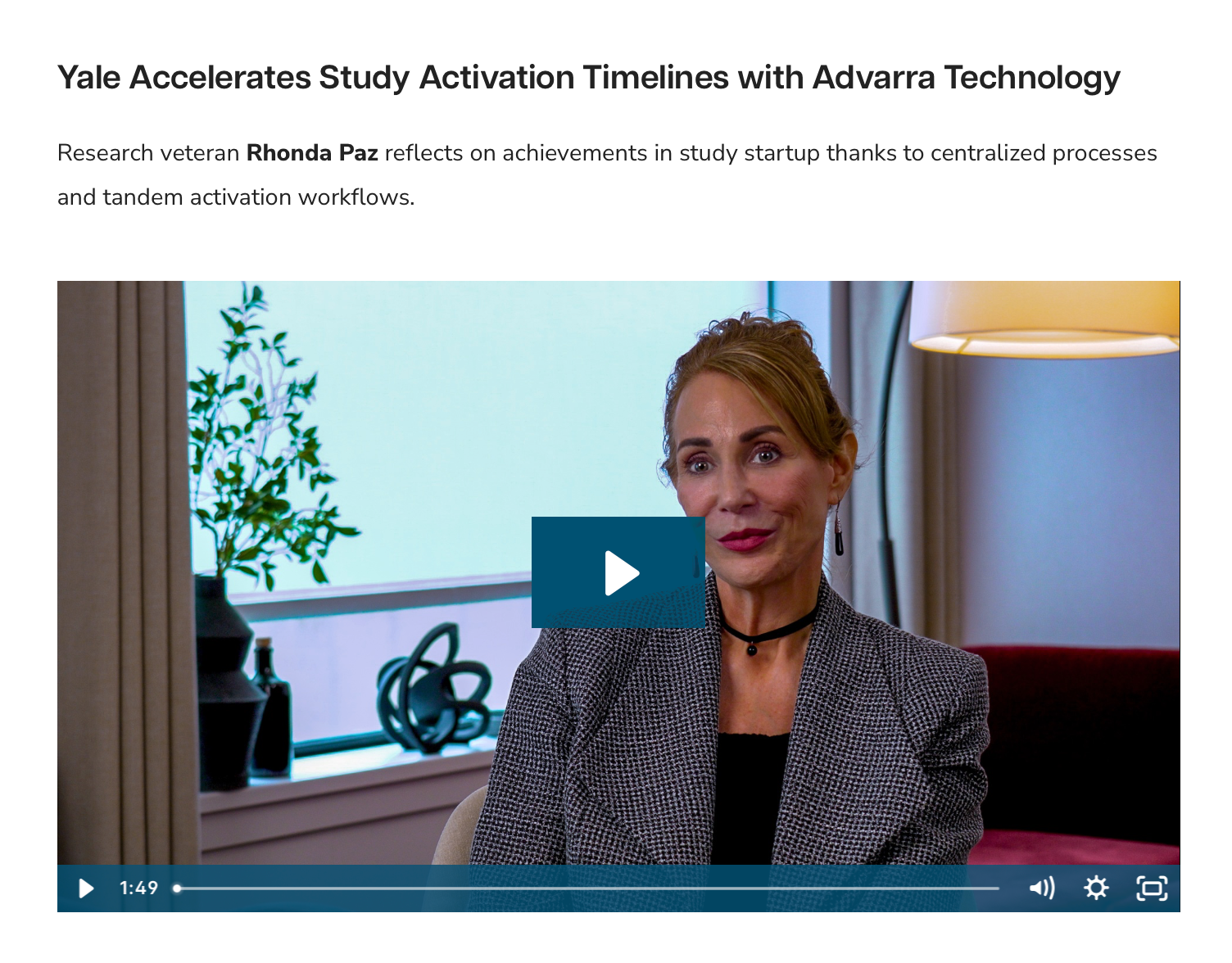
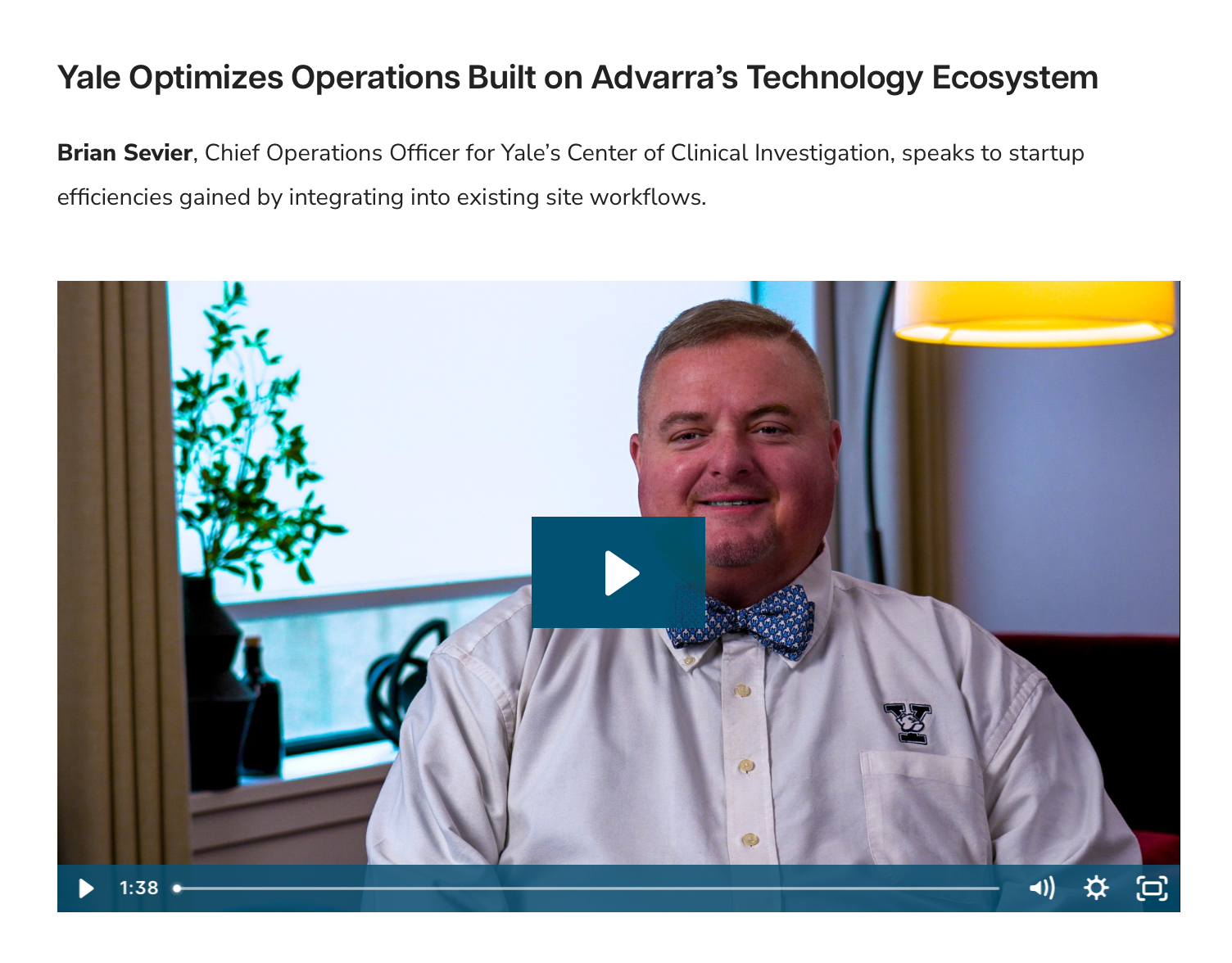
A series of client testimonial videos were recorded and displayed throughout the site to further highlight the client experience and quality of the Advarra products and services.
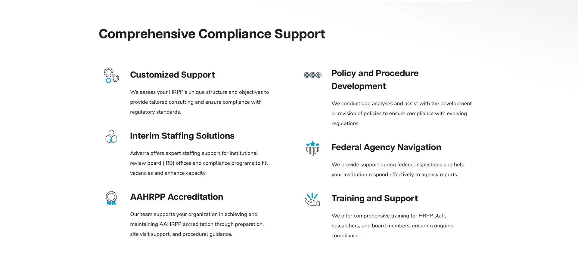
Improved Visual Communication
In tandem to this project an updated, bespoke set of icons was created to complement the container layouts and reflect the subject matter more specifically than could be achieved by an off-the-shelf icon library. A dual tone was selected to facilitate interest and tie in to the approachable nature of the overall design.
Advarra's former brand showcased a unique illustration style. Rather than hide or rework their past to look into the future, we opted to combine illustration with photography on featured images to marry the two styles into an inclusive display.
Explore More